Can You Guess To Which Brands These Old-School Logos Belong?
These brands used to look completely different!
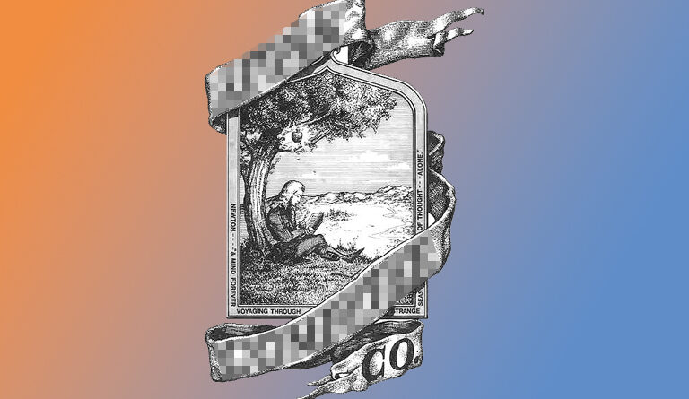
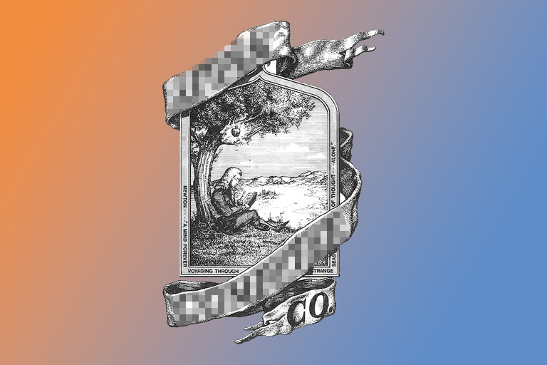
Can you guess which brand used to use the logo above? We’ll give you a hint: it was used back in 1976, when the company was first founded. If you look closely, you might be able to spot just which company used this scene as its primary logo. If you have no clue and want to know just who this logo belongs to, continue on to the next page.
Find out the answer on the next page!
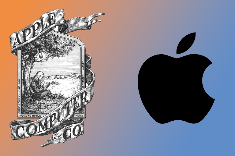
1. Apple
That’s right! The world-famous tech company Apple didn’t always use just the fruit as a logo. But if you look close, you will see that this scene depicting Isaac Newton has an apple in it. It is hanging from a branch just above the legendary physicist. Apple used this logo for a year, before switching over to the simpler image we’ve all come to know.
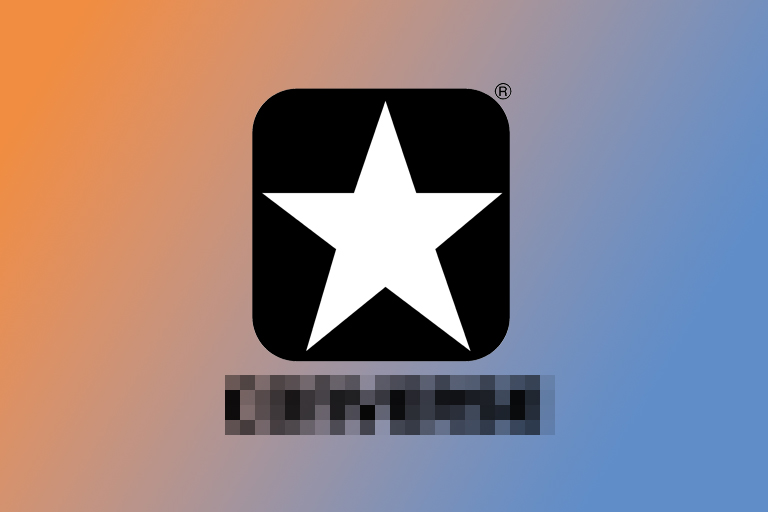
Ready to try another one? Take a guess at the logo above. Who do you think this logo used to belong to?
Whenever you’re ready, you will find the answer on the next page.
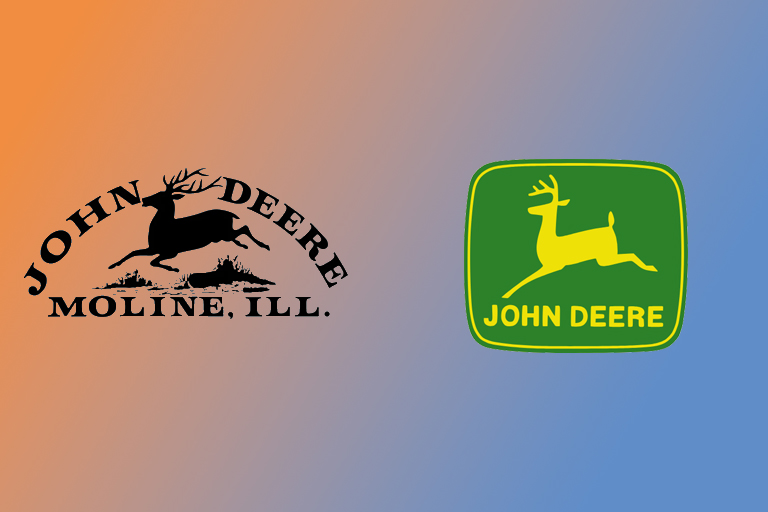
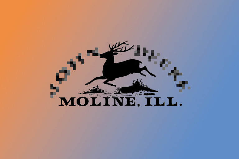
2. John Deere
Those of you familiar with this massive American agricultural corporation might have recognized the deer in the old logo. It was implemented in the year 1876, after the company had operated for over 40 years without an official logo. According to their website, the very real threat of fraud changed the unofficial logo into the first recognized symbol of agricultural excellence.
Ready to try another one? Take a guess at the logo above. Who do you think this logo used to belong to?
Whenever you’re ready, you will find the answer on the next page.
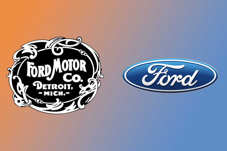
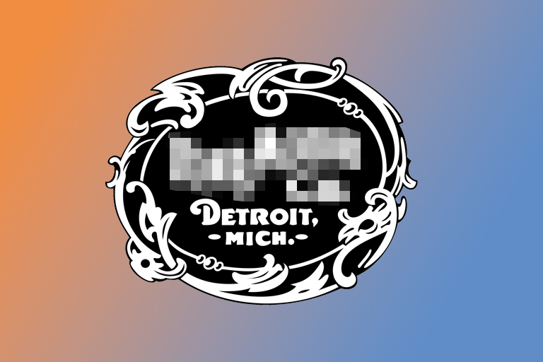
3. Ford
This classic logo belongs to the Ford Motor Company and dates from 1903. It also shows where the brand originated: Detroit. It’s a tasteful and elegant logo, which really captures the design trends of the early 20th century. Compared to the newer, modern logo, the old one looks really complex and ornate. Did you get it right?
Ready to try another one? Take a guess at the logo above. Who do you think this logo used to belong to?
Whenever you’re ready, you will find the answer on the next page.
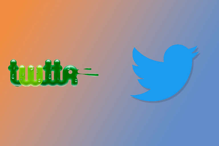
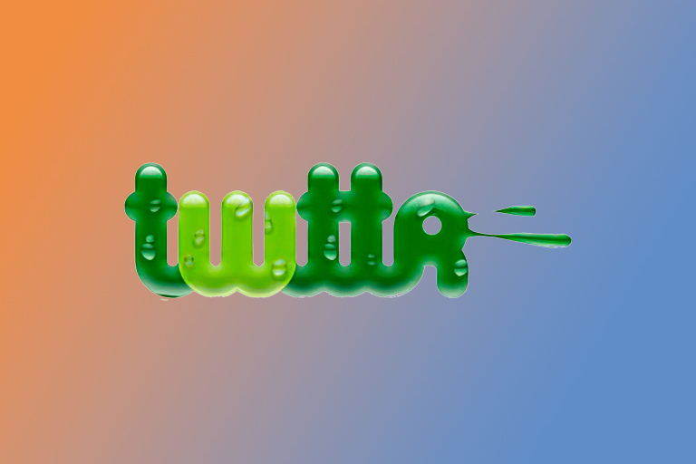
4. Twitter
Yes, this social media company hasn’t always used a bird as its logo! Back when it first launched, it used a green logo that said “twttr”. The social media platform used this logo during 2005 and 2006, before switching to a logo that contained the vowels and used the blue color we all associate with Twitter today.
Ready to try another one? Take a guess at the logo above. Who do you think this logo used to belong to?
Whenever you’re ready, you will find the answer on the next page.
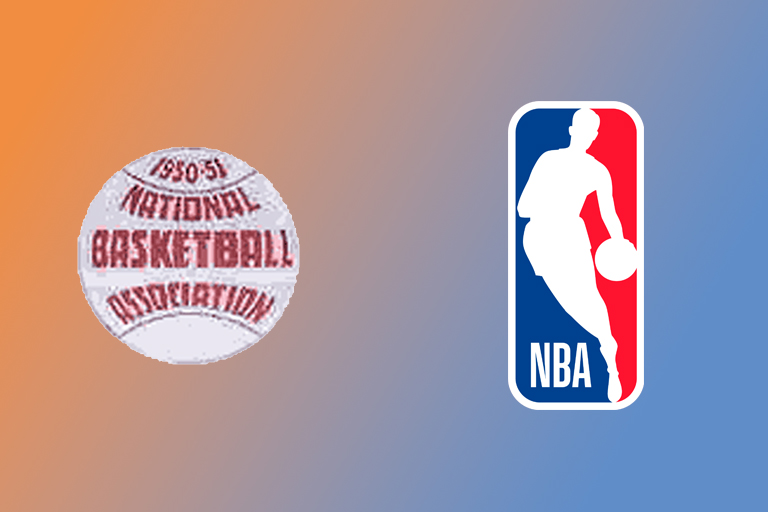
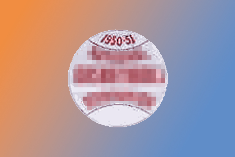
5. NBA
Surely you thought of something sports related. But that doesn’t look like a basketball, right? We know. Still, it is the old logo that the NBA used to use. It dates from the ‘50s. Nowadays, they use the well known logo on the right, with the basketball player and the red and blue colors.

Ready to try another one? Take a guess at the logo above. Who do you think this logo used to belong to?
Whenever you’re ready, you will find the answer on the next page.
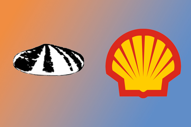
6. Shell
A shell that belongs to Shell. Still, it’s quite different from the logo they use nowadays. The company first started as a seashell trading company in 1900. They fused with the Dutch company Royal Oil in 1907, after which they continued as the Royal Shell Group. The choice of logo now seems pretty obvious, doesn’t it?
Ready to try another one? Take a guess at the logo above. Who do you think this logo used to belong to?
Whenever you’re ready, you will find the answer on the next page.
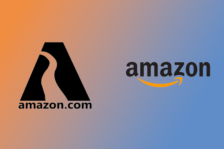
7. Amazon
Yes, that logo used to belong to Amazon. While you can now buy everything under the sun from the mega corporation, it started out as an online bookstore back in the ‘90s. Within two months of its launch, it was selling books in 45 different countries and generating a revenue of $20,000 per week. This marked the start of its rise to the number one spot.
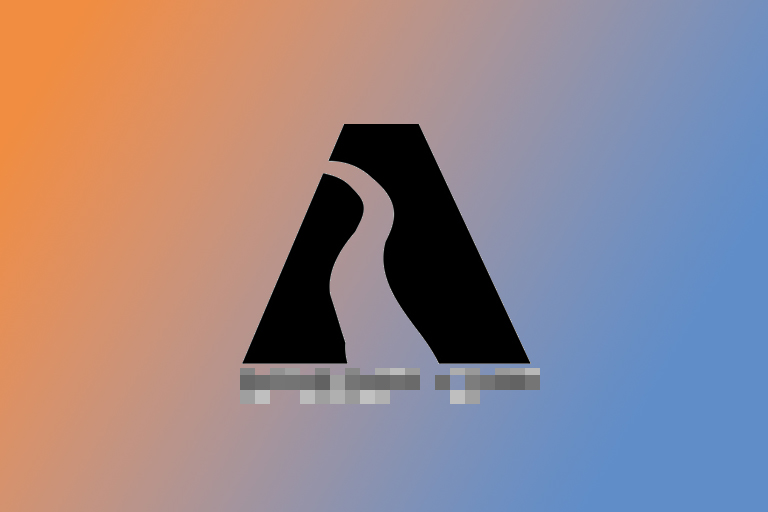
Ready to try another one? Take a guess at the logo above. Who do you think this logo used to belong to?
Whenever you’re ready, you will find the answer on the next page.
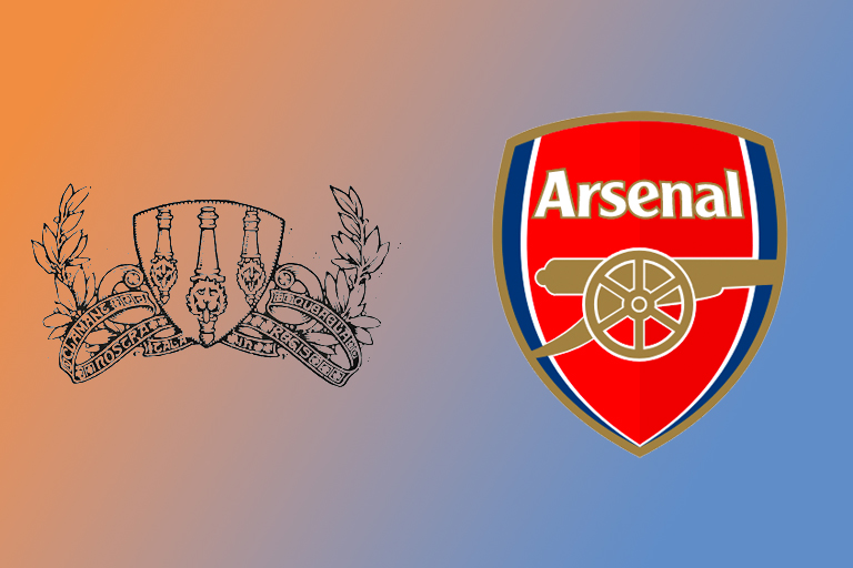
8. Arsenal
This one is for the soccer/football enthousiasts among us. This logo belongs to the London football club Arsenal FC. You might have recognized it because of the cannons which appear in both the classic version as well as the modern one. Isn’t it crazy how little it looks like what you would expect a football club’s logo or badge to look like?
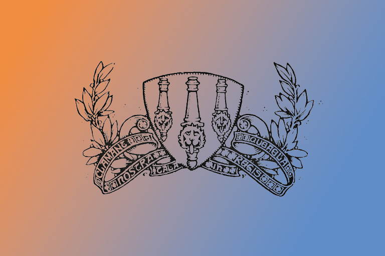
Ready to try another one? Take a guess at the logo above. Who do you think this logo used to belong to?
Whenever you’re ready, you will find the answer on the next page.
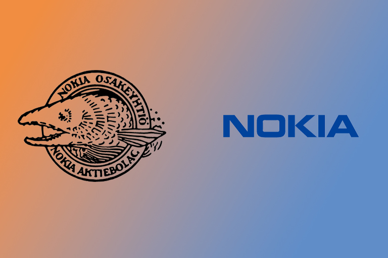
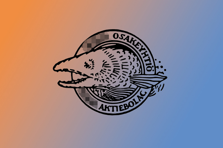
9. Nokia
Surely you must’ve gotten this one wrong. Nokia’s former logo doesn’t look like something you would associate with a telecom giant. It looks more like the logo of a fishing company. The fish depicted in the classic logo is a salmon, which links the company to its roots, a small village next to a river in Finland.
Ready to try another one? Take a guess at the logo above. Who do you think this logo used to belong to?
Whenever you’re ready, you will find the answer on the next page.
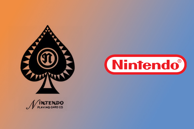
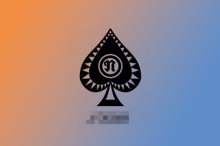
10. Nintendo
Did you get this one right? Nintendo started out as a playing card company, hence the classic logo in the shape of one of the classic card game symbols: spades. Only later did they branch out into videogames, which turned out to be one of the best business moves they could’ve made. Nowadays, Nintendo is one of the biggest videogame companies out there.
Ready to try another one? Take a guess at the logo above. Who do you think this logo used to belong to?
Whenever you’re ready, you will find the answer on the next page.
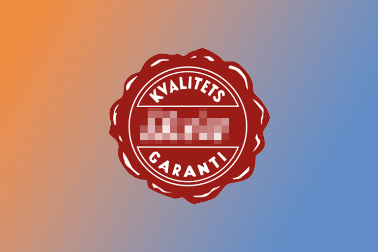
11. IKEA
IKEA has not always used its now world-famous blue and yellow logo. Before they switched to the design they are now associated with, they used a burgundy stamp as their logo. The words on the logo are Swedish and mean “Quality guarantee”. Even today, IKEA is known for its cheap, quality furniture that you have to assemble yourself.
Ready to try another one? Take a guess at the logo above. Who do you think this logo used to belong to?
Whenever you’re ready, you will find the answer on the next page.
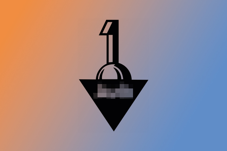
12. Audi
Worldfamous German car company Audi has always seen itself as number one, as is evident in the logo they used back in the day. No 4 rings, but a massive 1. They used this logo between 1909 and 1932. In 1932 they adopted the first version of their 4 rings-logo, after fusing into ‘Auto-Union’ with 3 other automobile companies.
Ready to try another one? Take a guess at the logo above. Who do you think this logo used to belong to?
Whenever you’re ready, you will find the answer on the next page.
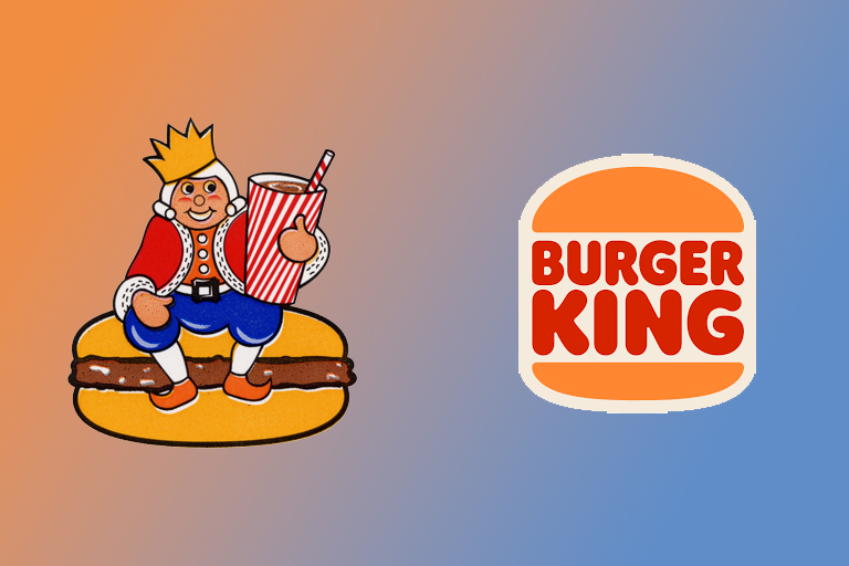
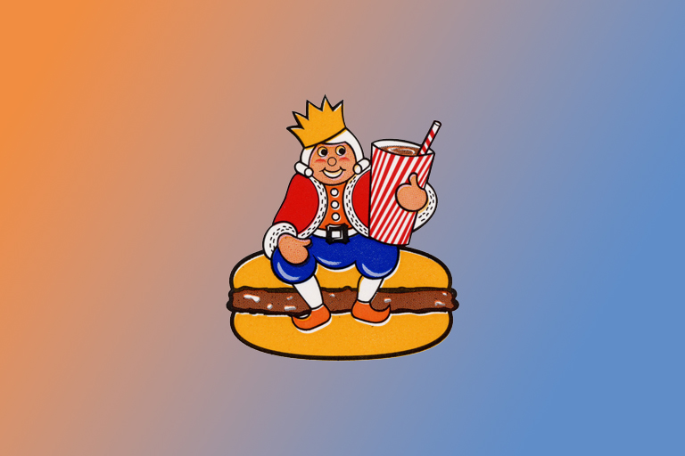
13. Burger King
We’ll admit, this one was pretty easy. We just wanted to show you Burger King’s old logo because we absolutely love it. The new one is minimalistic and well-designed, but in our opinion nothing beats the old logo of a king sitting on top of a burger. Unfortunately, the fast food company stopped using this charming logo in 1969.
Ready to try another one? Take a guess at the logo above. Who do you think this logo used to belong to?
Whenever you’re ready, you will find the answer on the next page.
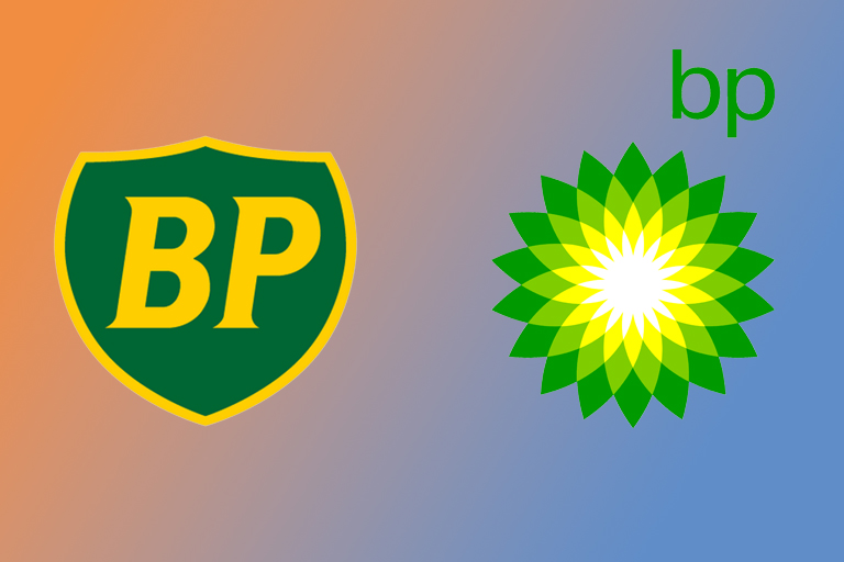
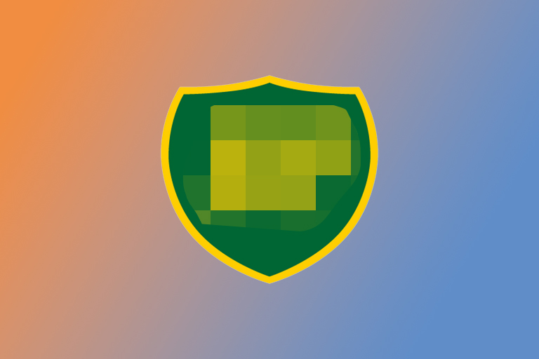
14. BP
Did you get this one right? Oil company BP used the green-and-yellow shield as their logo between 1947 and 2000. When they changed it to the more contemporary, abstract logo seen on the right, it sparked quite a lot of controversy around the world. They have however stuck with their choice and are still using this logo in 2022.
Ready to try another one? Take a guess at the logo above. Who do you think this logo used to belong to?
Whenever you’re ready, you will find the answer on the next page.
Source: https://www.tips-and-tricks.co/various/can-you-guess-to-which-brands-these-old-school-logos-belong/